ESPC guide on colour psychology
This week ESPC Paper Editor, Lisa Venter, takes a look at the rather interesting topic of colour psychology. In this arena, colour is thought of as part of ‘Feng Shui’ to make sure that whatever room colour is used in, it stimulates a certain psychological response. It doesn’t have to be too scientific though, as Lisa explains below…

Choosing the right colour
Before you walk headstrong into a hardware store to choose your new tin of paint, why not take a look through our guide on colour psychology? Whether you are looking to buy a property, rent a flat in Edinburgh or jusyt improve your existing property for sale then why not start with ESPC? No. 1 for property in East Central Scotland.
The colour you choose could vastly improve your surroundings and even improve your level of happiness.
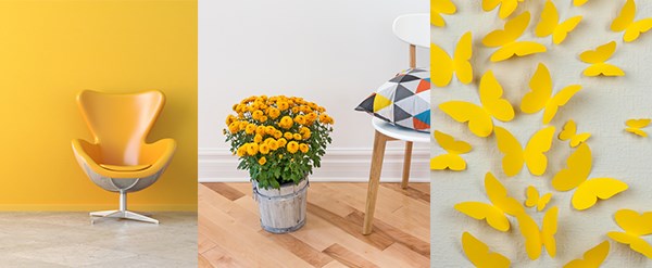
Yellow
Design and architecture website Fresh Home (freshome.com) says that yellow is a joyous colour to be used in public spaces in the home.
They tell us that:
"[Yellow] captures the joy of sunshine and communicates happiness. It is perfect for kitchens, dining rooms, and bathrooms, where happy colours are energizing and uplifting.
In halls, entries, and small spaces, yellow can feel expansive and welcoming. Even though yellow is a cheery colour, it is not a good choice to use in main colour schemes when it comes to designing a room."
Be careful though as Fresh Home cautions the following,
"Studies show that people are more likely to lose their temper in a yellow interior. Babies also seem to cry more in a yellow room. In large amounts, this colour tends to create feelings of frustration and anger in people."
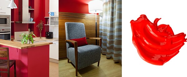
Dark colours
Readers Digest (rd.com) warns against using dark colours in excess saying:
"Dark colours, such as red, purple, blue, and dark shades of green, can have a constricting and gloomy effect. But when applied in the right place or as accent elements, they can help convey comfort and security."
Ideas for using these colours may be incorporating them into accent walls either through matt paint or wallpaper.
Try and use a colour wheel to match your dark colour with something more neutral for example, match dark green and a light grey so that you can figure out which accent colour to use alongside a main colour if you are choosing to repaint an entire room; alternatively do this with the colour you already have in a room before choosing an accent colour to avoid mistakes.
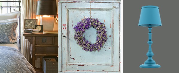
Shades of blue and lavender
Health website, WebMD (webmd.com) recommends going with calming hues for the bedroom explaining,
"The bedroom is where you go to relax and reconnect with your partner. Cool colours - blues, greens and lavenders - can be great choices here, because they are thought to have a calming effect. The darker the hue, the more pronounced the effect is believed to be."
English countryside and French boutique hotel decor is all the rage in interior trends these days so what better way to give a bedroom a fresh new look than with a shade of blue or lavender and accent shades in these colours?
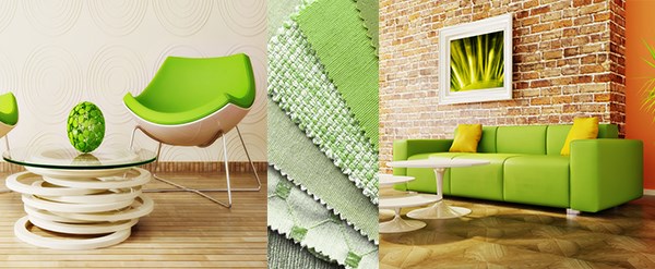
Eco green
The DIY Network (diynetwork.com) suggests green be used in rooms that require clarity of mind such as home offices saying:
“Because we focus the colour green directly on the retina, it's the easiest colour for the eye to see. It's the best colour to use in a study or library, helping you to read, relax and concentrate.
The colour is also connected with feelings of security and stability. Because it's considered the colour of home and hearth, it can help ease homesickness.”